Overview Dashboard
The Overview Dashboard provides a high level view of client adoption and activity. Here you will find 7 simple charts to give you a quick glance into your solution’s performance.
In Analytics Suite, select Overview in the navigation menu on the left. The following charts are displayed on this page:
- Adoption last 90 days
- Active user count over time
- Adoption over time
- Active users by month
- Total users by month
- Users with external accounts
- Total accounts by month
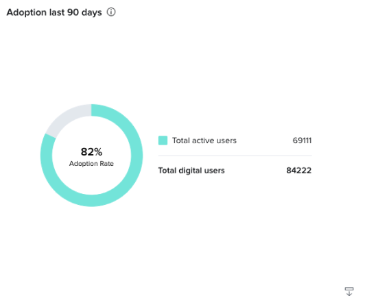
Adoption last 90 days
The Adoption last 90 days chart shows you the percentage of online banking users that have become MX users in the past 90 days. If you want a deeper look into the user activity in the platform, you can export this chart by clicking the export button in the bottom right corner of the card. The export will appear in your exports tab and will contain:
- User internal guid
- User external guid
- User analytics session date
- When the user was first created
- Which platform the user accessed, web or mobile.
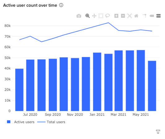
Active User Count Over Time
The Active User Count over time graph shows you the total number of users and the active number of users. If you can’t see any of the bars in the graph, use the mouse to click and drag on the area you want to zoom in. This chart was built to help with answering billing questions, so our billing should closely align to what you see on the chart.
An active user is defined as someone who has at least one visit to one of MX’s MoneyMap, MXinsights, or Helios products during the time frame indicated. Total users are counted as all Online Banking users.
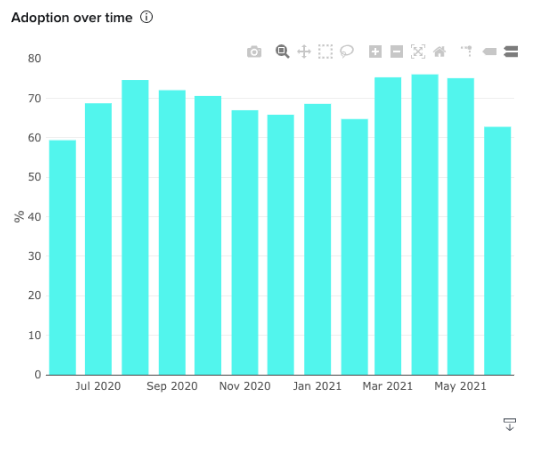
Adoption Over Time�
The Adoption over time chart shows you the percentage of your online banking users that are using MX products month by month. It is calculated as Total MX Product Users divided by Total Online Banking Users.
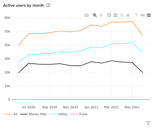
Active Users By Month
The Active Users by Month chart shows the total distinct active user counts across MX’s MoneyMap, Helios, and MXinsights products.
An active user is defined as someone who has at least one visit to your desktop or mobile product during the time frame indicated.
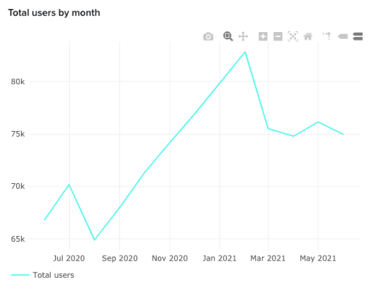
Total Users By Month
The total users by month chart shows you the number of total users month by month.
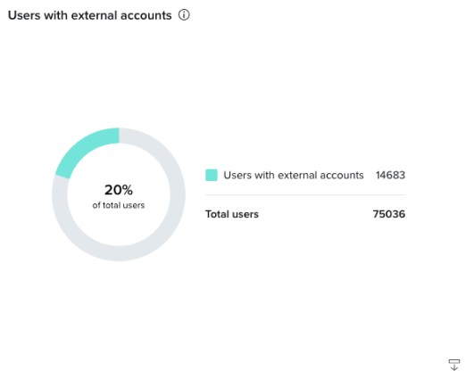
Users With External Accounts
The Users with external accounts chart shows you the percentage of your users that have at least one external account. It’s calculated as (Total Users with External Accounts)/(Total Users). An MX user is any user that is created on the MX platform.
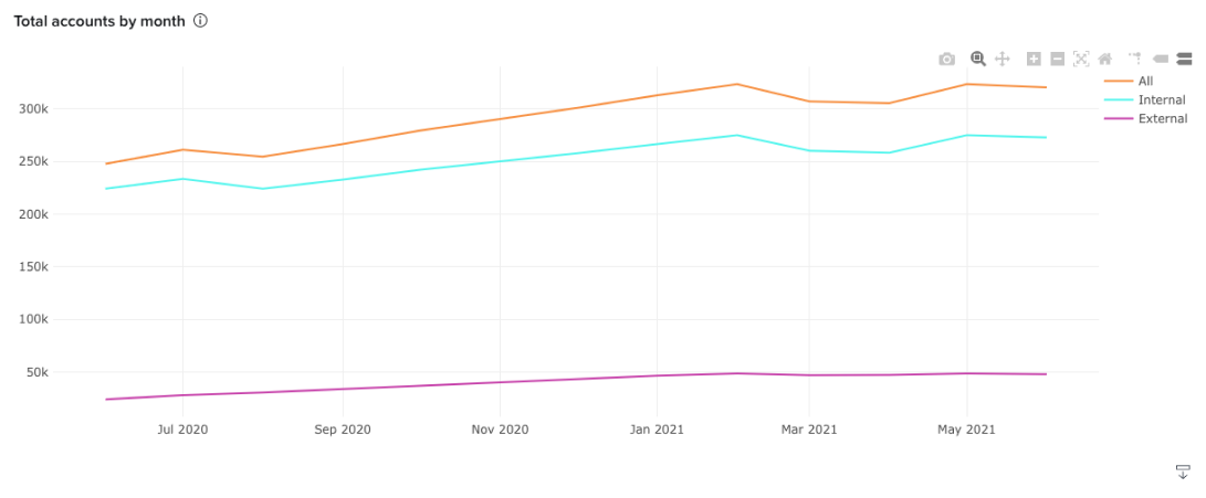
Total accounts by month
The Total accounts by month chart shows you the number of all accounts, both external and internal. At the bottom of the page, you’ll find links to helpful resources as well as your MX Client Success consultant’s contact information.